Adventures in Letterpress Printing
Robert Lomascolo and sonnet 117
If you want to understand the amazing work that Robert LoMascolo does at his one-man letterpress studio in Aurora, New York, there is one story that perfectly encapsulates his work: the printing of Sonnet 117.
In 2016, the Bodleian Library at the University of Oxford held a series of events to commemorate the 400th anniversary of Shakespeare’s death. Printers from around the world were invited to contribute their own hand-printed interpretations of one of Shakespeare’s sonnets. Rob LoMascolo had been working independently as a printer since 2010, and decided to tackle a print of Shakespeare’s Sonnet 117. When it was completed, the project would exemplify a number of Rob’s distinctive skills as a printmaker.
In order to understand how the project came together, you first have to know about the press—a whole story in its own right.
Chapter 1: The Press
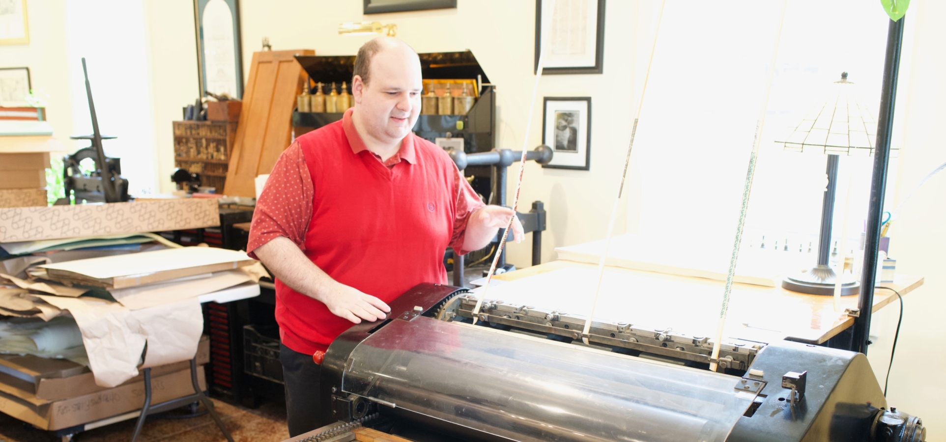
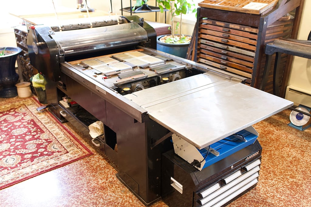
Rob’s print of Sonnet 117 was done on a Vandercook Universal 4—a very rare letterpress machine, one of only four known to exist. The Vandercook was Rob’s third press: when it appeared in 2011, he’d been operating his printing business out of his family’s garage for about a year, gradually building up a collection of presses to handle a variety of jobs.
The Vandercook Universal 4 originally debuted in 1958. At that time, with no digital technology available, the Vandercook was designed as a reproduction proof press, bridging the transition from letterpress to offset lithography for commercial printing. With this machine, one copy was printed from metal type, and then photographed; copies were made from the photograph using other methods. In order to produce prints that are finely-detailed enough to be photographed and enlarged, the Vandercook was built to be an ultra-precise machine. And it’s about the size of a small car.
As you might imagine, collecting vintage or antique letterpress printing machines is a unique pursuit. There’s a close-knit community of letterpress aficionados in the United States, and the advent of the Internet has allowed for the careful cataloging of working machines. Some are kept in private collections; some are displayed in museums; some are housed in public institutions, like the Book Arts Center at Wells College.
Rob first heard about this particular Vandercook through the letterpress grapevine. A Massachusetts printer was getting out of the letterpress business, moving to digital printing, and looking to sell off his equipment—including the Vandercook. As in all of his work, Rob was diligent and persistent in pursuing the purchase: gradually getting to know the seller, contacting him at least once a month to express his interest. After a full year of back-and-forth, Rob had developed a good relationship with the seller. But at the last moment, the printer from Massachusetts decided to sell the Vandercook to a friend for $20,000.
When buying presses, Rob has a rule of thumb for valuing the equipment: “If it costs a dollar per pound, it’s a good price.” The Vandercook weighs in at about 3,000 pounds. According to Rob’s rule, at upwards of $6 per pound, $20,000 would be a premium price—more than he was prepared to spend.
However! Somehow, miraculously, there was a second press that had escaped notice. The printer from Massachusetts told Rob that he owned another Vandercook like the one he had just sold. It had been completely disassembled, stored in a basement, and generally neglected. The seller had no idea if the entire press was still there. Or if it would still work. But if Rob wanted to buy it, he’d sell it for $2,500. Less than a dollar per pound for one of the rarest machines in the business. If the pieces were all there—if Rob could get it working again—he’d be digging up buried treasure.
“So I got in my little Honda Civic and drove to Massachusetts the next day,” recalls Rob. “And literally every single nut, screw, and bolt was in soggy cardboard boxes. I took all the pieces I could fit into my car—and drove back so he couldn’t change his mind.”
Word got out almost immediately about Rob’s buried treasure. There weren’t many machines that had escaped notice within the community of letterpress enthusiasts; Rob had two competing offers for the press almost instantly.
“I could have made money without doing anything,” says Rob. “But I didn’t sell it.”
Finally, with the help of a specialty mover, Rob was able to get all three thousand pounds of Vandercook back to his workshop. Thanks to his patience and a stroke of great fortune, he’d gotten one of the most valuable presses on the market for a steal.
Now he had to get it working.
Chapter 2: The Restoration
In an era of digital publishing, it can be hard for those who aren’t familiar with letterpress printing machines to imagine the labor of love that goes into their restoration and maintenance.
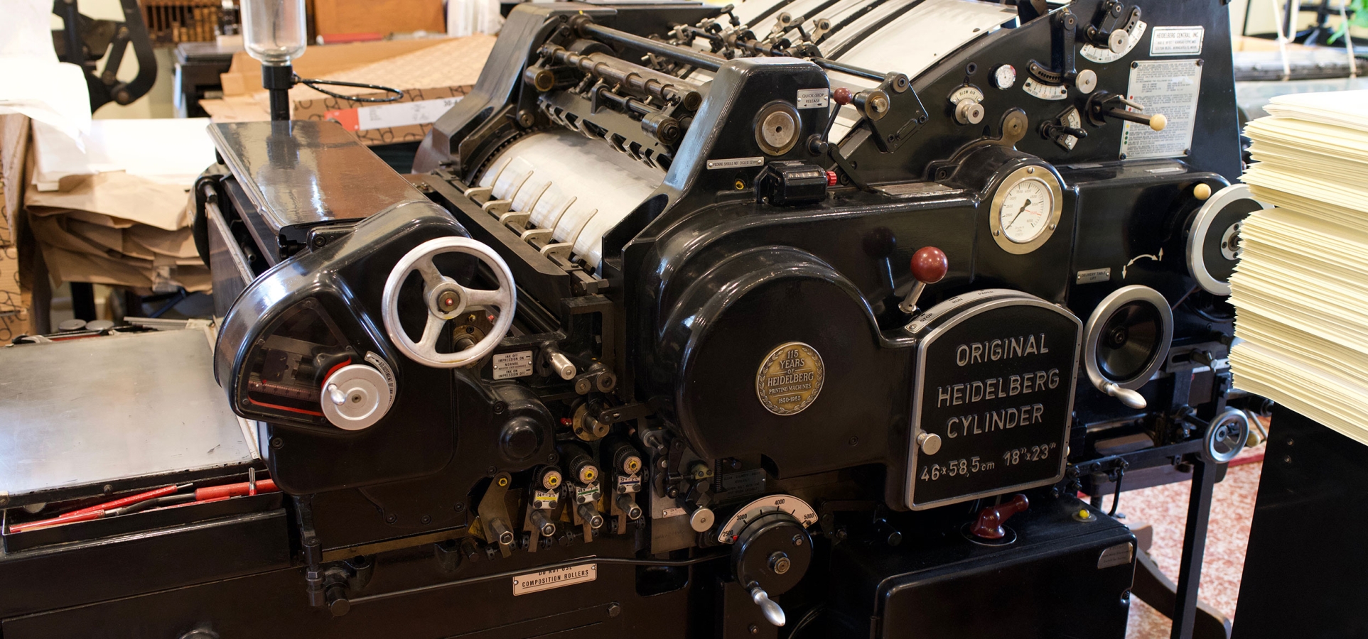
There isn’t much customer support left for Vandercook machines. The Vandercook family sold the company in 1968 and production of the Vandercook Universal 4 ended a year later. The company changed hands several times in the following decades. By the time Rob’s press arrived at his workshop, the distribution rights for Vandercook machines were held by a single die-hard supplier in Colorado, doing his best to scoop up parts from rapidly dwindling stocks. (A typical and telling disclaimer currently on the supplier’s website: “Some things like Kort Gauge Pins are no longer manufactured and the equipment has been disbursed. Butch Kort is 92 and it’s time for him to retire.”)
Restoring a precision piece of machinery with missing parts means either a nationwide scavenger hunt to find replacements, or sheer resourcefulness. In order to do this work—in addition to being a talented artist and a skilled craftsman—Rob also needs to be a part-time mechanical engineer.
“[The Vandercook] had a pretty serious electrical issue, which we couldn’t figure out. The mechanical stuff actually went together fairly quickly… it was just a big puzzle, with all these little parts. I would say maybe 90% of it was there. One major part was missing, but I was able to improvise a solution,” says Rob.
“The major thing the press was missing was an optional device that automatically returns each sheet to the operator after it is printed. Without it, the operator needs to walk back and forth with the press to collect the sheets. Not a huge deal, but an annoyance. I asked a machine shop about fabricating the missing components, and they wanted over a thousand dollars. I can’t take full credit for the improvised solution—it came from an offhand comment from an old timer at a printing conference—but it was an epiphany! Essentially, a pair of unmodified retractable dog leashes and a bit of steel pipe from the hardware store are able to perfectly replicate the function of the missing, and far more complicated, mechanism.”
The electrical problem eventually revealed itself—by catching fire.
“There was a… small… electrical fire,” laughs Rob. He’s remarkably good-humored about it for someone who’s surrounded by rare books, painstakingly curated equipment, and lots of very expensive—very flammable—fine paper.
Once the electrical problem was extinguished, uncovered, and repaired, along with Rob’s improvised mechanical repair, the Vandercook ran like a charm. Five years later, Rob decided it would be the perfect press for Sonnet 117.
Chapter 3: The Printing
This is another part of the letterpress printing process that’s difficult to imagine in a digital publishing world: color.
Traditional letterpress prints are typically limited to one or two colors for this very reason. Letterpress plates are binary: the raised areas on the plate, covered with ink, will contact the paper, while the empty spaces won’t. Black and white is relatively straightforward. Adding one or two more colors is tricky, but doable: the plates have to be set up just right, and the same piece has to travel through the press once for each color, which means carefully aligning everything on each pass.
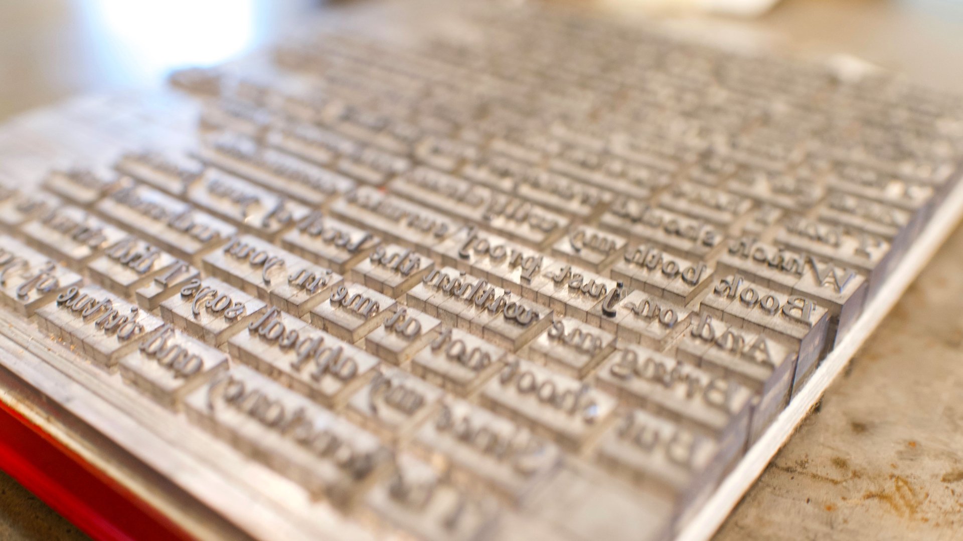
Since the Sonnet 117 project was a prestige piece that was to going to be submitted to a world-renowned literary institution, Rob decided to pull out all the stops. His print of Sonnet 117 would feature hand-set metal type, illustrated with his own imagery inspired by the natural beauty of the Finger Lakes—combining cyan, magenta, yellow, and black ink into one full-color image. Just like a modern computer printer, only much more difficult.
“You can do that with letterpress, but there are very few examples of people doing it, because it’s hard to do, and very, very few contemporary examples—practically none—of this being done,” says Rob.
Using a book from the 1920s that described some of the math involved in process color letterpress printing, Rob figured out a way to update the procedure with modern technology. He used a computer program to take his original watercolor illustration and create individual plates for each color, which saved him from having to do all of the complicated formulas described in the book. (“I’m not a math person,” says Rob.)
One of Rob’s mentors, who is also a luminary in the letterpress community, collaborated with him on the handset metal type. Michael Bixler, at the Bixler Press & Letterfoundry in Skaneateles, is one of only a few people in the United States who still casts the little metal letters used for printing presses. In order to get the correct spacing on his type, Rob had to shave down the metal typefaces with a printers’ saw, a thousandth of an inch at a time.
Once the plates were made and the type was set, Rob had to tackle the very delicate work of printing overlapped layers of color on the same sheet. The whole process required eight repetitions of printing, cleaning, resetting, and realigning each plate—without any mistakes. The super-precise Vandercook Universal 4 was the ideal machine to use for this job.
Rob added some additional flourishes with each pass through the printer: a subtly different shade of black (which does exist) for the lettering; gold ink for the first letter; a clear coat to make certain areas pop more. “You’re holding up two copies of the print to friends and family and asking if they can tell the difference… half of them are saying ‘No,’ but you’re going to do it anyway, because it looks ever so slightly better,” says Rob.
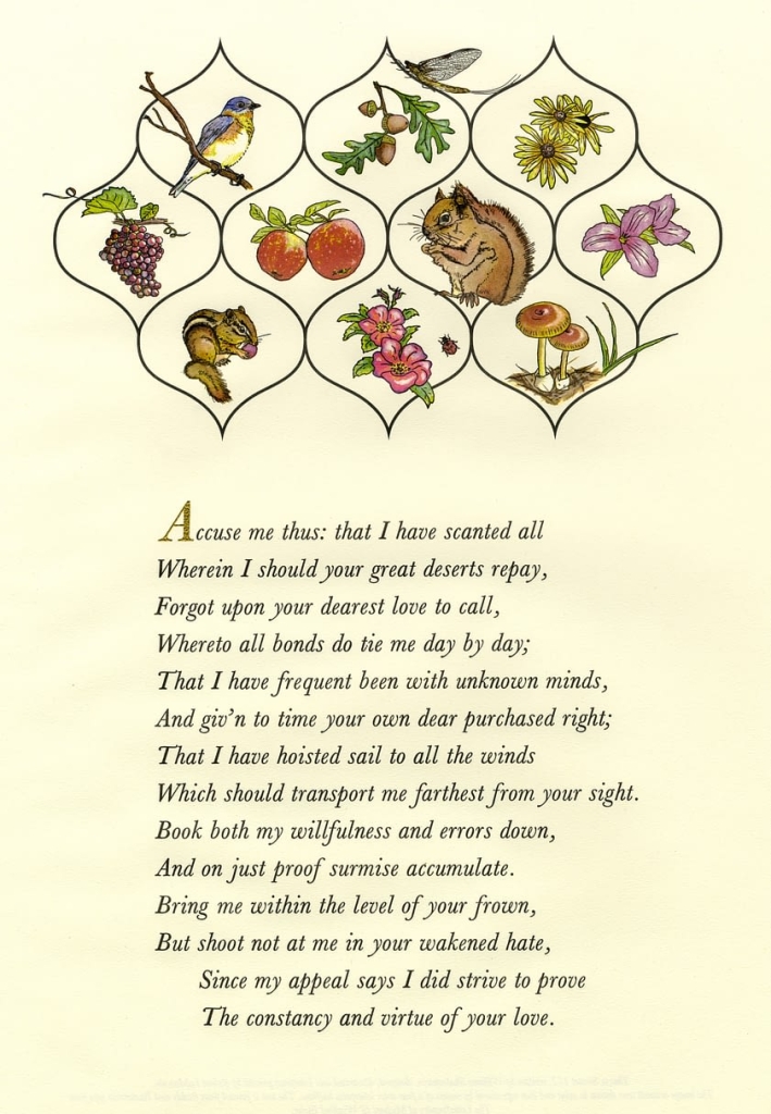
Sonnet 117 broadside by Robert LoMascolo.
The finished product is gorgeous. Even without recognizing all the subtle details that make it exceptional from a technical standpoint, it’s a striking work of art. Rob’s original illustrations beautifully evoke the landscape of the Finger Lakes. A two-dimensional image doesn’t entirely do justice to the actual print—the depth of color, the imprint of the press, the grain of the paper.
This is just one example of Rob’s work: his portfolio also includes invitations made for the Frick’s annual gala, prints for Princeton University’s Cotsen Children’s Library, and premium editions of classic novels for Suntup Press, to name just a few. Still, the Sonnet 117 piece is unique for exemplifying the skill, dedication, and innovation that Rob brings to his work. As an artwork that presents the character of the Finger Lakes to an international audience, in both its imagery and its provenance, it’s a spectacular signature piece for one of the region’s most talented artists.
The Press of Robert LoMascolo is located at 2211 Moonshine Road, Aurora, NY, 13026. Copies of Rob’s Sonnet 117 print are available for purchase (along with a wonderful selection of letterpress products) via his online store.
Rob welcomes visitors to his studio by appointment between the hours of 9:00 a.m. and 5:00 p.m., Monday through Friday. We often host workshops with Rob at the Schoolhouse, our activities center. View our activities calendar to check the schedule.


